Last updated: October 30, 2026
Key Takeaways
- A personal initial pendant works when the letter, style, and proportions clearly match one person or relationship.
- The best letter is the one with the strongest everyday meaning.
- Choose a font that suits the wearer’s clothes and how visible you want the necklace to be.
- A pendant looks most natural when its size fits the chain length and the wearer’s frame.
An initial pendant necklace works best when the letter, font, and scale feel like something you would actually wear every week, not just on the day you receive it. The topic “Initial pendant necklaces: how to choose a letter pendant that feels personal” starts with fit: if the pendant looks intentional on your neck, your wardrobe, and the person you are buying it for, it is more likely to be worn often.
What makes an initial pendant necklace feel personal
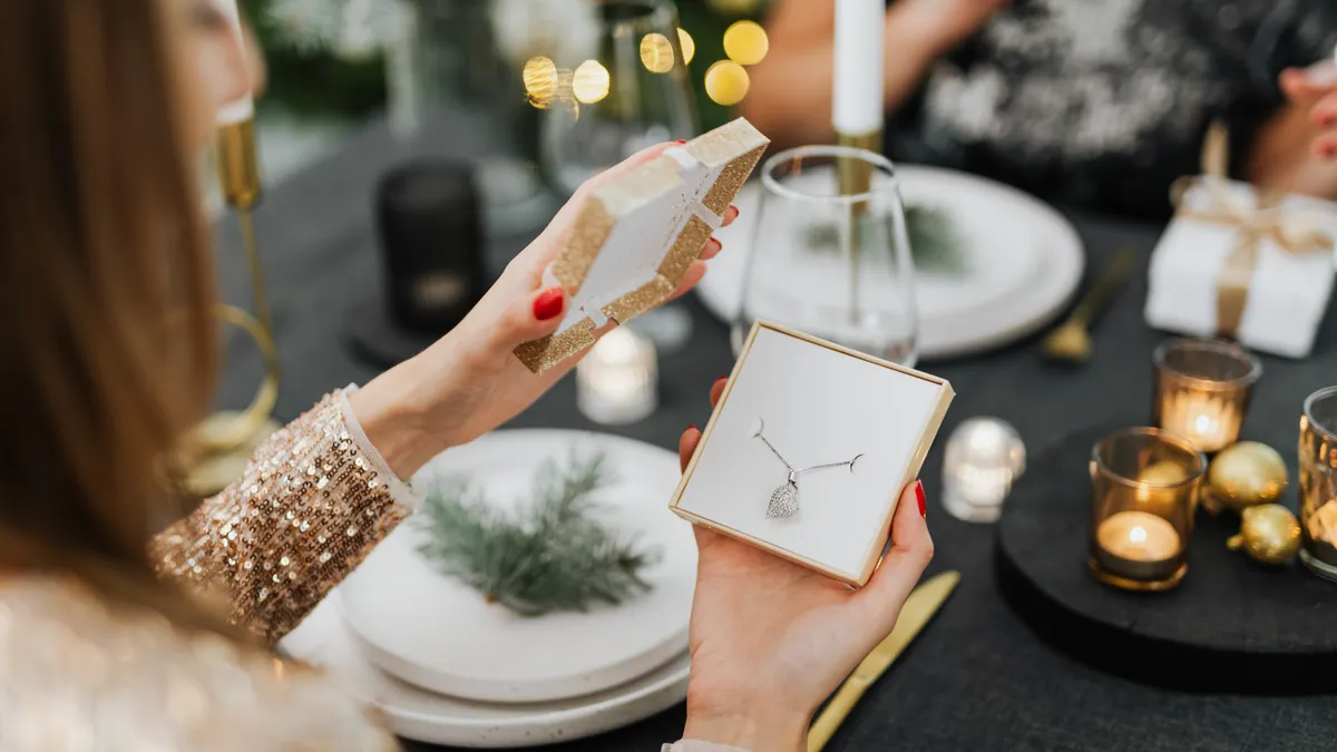
An initial pendant necklace feels personal when the letter, style, and proportions point clearly to one person or one relationship. A single letter on a chain can read as intimate, restrained, and easy to wear; a monogram can feel more formal or more decorative; a letter charm can feel playful and stackable. The same initial can say three different things depending on whether it appears in block type, script, or a rounded serif.
Start with the reason you want it. A gift necklace for a partner usually works best when the letter is unmistakable and the design is clean enough to wear daily. A self-purchase often benefits from a more subtle presentation, such as a small 10 mm to 15 mm pendant that sits close to the collarbone. If the goal is to mark a child, a last name, or a shared identity, a monogram or layered initials can feel more thoughtful than a lone letter.
The main mistake is choosing what photographs well instead of what wears well. A pendant that looks striking in a product shot can feel too large, too shiny, or too ornate at normal distance. I would treat the pendant as an everyday object first and a gift second, and if you are unsure how it will wear, consult a jeweler or other qualified professional before buying. For a broader primer on chain-and-pendant terminology, the hub on what is a pendant necklace is the right place to start, then come back here for the personalization decision.
How do I choose the right letter for a pendant?
The right letter is usually the one that has the clearest personal meaning without needing explanation. For most buyers, that means an initial pendant necklace built around a first name initial, a surname initial, a child’s initial, or a couple’s shared letter. A single letter keeps the read simple; a monogram adds more context but also more visual weight.
Use this order when deciding:
- Pick the identity you want the necklace to signal: self, partner, child, family name, or friendship. That choice narrows the field before you look at fonts.
- Decide whether one letter is enough. A single-letter pendant is cleaner and more versatile; a two- or three-letter monogram reads more specific but can look busier at 12 mm to 20 mm wide.
- Check the name itself. If the person goes by a nickname or middle name, the “obvious” initial may not be the meaningful one.
- Think about ambiguity. Letters like M, W, and V can look decorative but harder to read at small sizes, while I, L, and T can disappear if the font is too thin.
- Match the letter to the occasion. A graduation gift may suit a surname initial; a birthday gift often feels more personal with a first initial.
One trade-off matters here: the more private the meaning, the less immediately legible the piece becomes to other people. That can be good if the necklace is for the wearer alone. It can be frustrating if you want the personalization to be noticed at a glance. If you want the letter to read from roughly 1 to 2 feet away, avoid tiny script and choose a shape with a strong vertical and horizontal structure.
A good rule is simple: if you hesitate between two initials, choose the one the wearer uses most often in life, not the one that sounds prettier.
What font style should you pick for an initial pendant necklace?
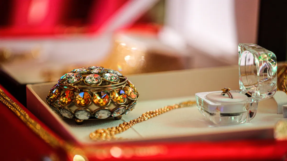
The font style should match the wearer’s everyday clothes and the level of attention you want the necklace to draw. Font changes the whole mood of an initial pendant necklace more than most shoppers expect. A block font looks modern and crisp, a serif font feels classic, and a script font reads romantic or decorative. The letter itself stays the same; the emotional tone changes.
A useful way to choose is to compare the pendant with the wearer’s jewelry habits. If they already wear minimal hoop earrings or a plain 16-inch chain, a simple sans serif or engraved-style letter will usually fit better than a swirly script. If they like layered necklaces, textured chains, or pieces with a softer look, a script or serif initial can hold its own.
The practical issue is legibility. Thin script letters can blend together at very small sizes, especially when the pendant is under 15 mm. Bold block letters are easier to read but can feel less delicate. Serif letters sit in the middle: they often keep a classic look without becoming hard to read.
Avoid choosing a font from a thumbnail alone. Look for the actual stroke weight, the amount of negative space inside the letter, and whether the design keeps its shape when viewed from 3 feet away. The letter “R,” for example, can look strong in one font and awkward in another because of the leg and bowl. A rounded “S” may feel balanced in a monogram but loose in a single-letter pendant.
Who this is not for: if the wearer wants jewelry that disappears into an outfit, a highly stylized font may be too much. In that case, a flat engraved letter or a very plain pendant will age better than a dramatic script. Font choice is where many gifts become either very personal or oddly costume-like, so restraint usually wins.
Which size and shape look natural on the neck?
A pendant looks natural when its size matches both the chain length and the wearer’s frame. For most people, an initial pendant around 10 mm to 20 mm tall is the sweet spot for everyday wear, while larger formats are better when the pendant is meant to be the main focal point. The shape should also support the letter instead of fighting it.
A round disc gives the letter a neat boundary and works well for engraved or cutout initials. A vertical plaque makes tall letters look elegant and gives room for a more structured font. A freeform charm can feel more casual, but it is easier to misread if the letter has curves or loops. If you want the necklace to layer, a slimmer shape usually sits better with other chains because it moves less and catches fewer edges.
Necklace length matters too. A 16-inch chain usually sits high enough to keep a small initial visible above most necklines, while an 18-inch chain often gives a little more drop and a less fussy look. A very short chain can make a larger pendant sit awkwardly near the throat; a longer chain can let a tiny pendant vanish into clothing. The same pendant can look either poised or lost depending on a 2-inch difference.
There is a hidden cost to oversized initials: they can dominate the face and collarbone area and make the design feel less personal, not more. If the goal is a keepsake, a larger pendant is not automatically better. The most wearable pieces usually strike a balance between visibility and restraint.
If you are buying for someone petite or for someone who favors delicate jewelry, keep the pendant modest. If you are choosing for a person who likes bold pieces, a more generous size can be the right call, but only if the letter remains clear at a glance.
How to make a gift necklace feel thoughtful, not generic
A gift necklace feels thoughtful when the personalization matches the person’s habits, name, and style instead of just their initial. The difference between a generic present and a meaningful one is usually in the details: which letter you choose, how the chain sits, and whether the design looks chosen for them rather than for a gift display.
Start with the name question. Use the initial they actually identify with. That may be a first name, but it may also be a last name, a married name, a nickname, or a child’s name for a parent. If you are buying a monogram, make sure you know the correct order before you order anything custom. Monogram order can vary by style, and a reversed set of initials looks careless.
The wardrobe should guide the choice, too. A person who wears black, white, and denim is often better served by a clean, understated letter pendant than by something ornate. A person who layers three necklaces at once may like a charm that can sit beside other pieces without competing. Even the chain thickness matters: a fine chain supports a delicate letter, while a heavier chain can make the pendant look mismatched unless the design is equally strong.
If the occasion is sentimental, consider the back of the pendant as well. Some initial pendant necklaces allow engraving on the reverse, which can add a date, a name, or a short message without changing the front-facing design. A 2-line engraving is often enough; anything longer can crowd a small pendant and make the piece harder to read.
The honest downside of personalization is that it narrows the audience. A letter that feels perfect for one person may feel too intimate, too obvious, or too ordinary for another. That is why a single, clear initial can be a practical choice when you want something simple and wearable.
How to layer initials without making the necklace messy
Layering initials works when the pendants differ enough in length, size, or shape that each one can breathe. The simplest combination is one initial pendant necklace with one plain chain. If you add a second pendant, keep at least a small visual difference between them, such as a 2-inch chain gap or one piece that is visibly lighter in scale.
Layering is easiest when one piece stays close to the neck and the other drops lower. A 14-inch or 16-inch chain can frame the collarbone, while an 18-inch or 20-inch chain gives the second piece room to sit below it. If both chains fall at nearly the same point, the letters can tangle and the look becomes cluttered fast. That is especially true with sharp-edged fonts or thicker jump rings.
The layering options that usually work best are a single-letter pendant paired with a simple bar, disc, or fine chain. Two initials can work too, but only if they are clearly different in size or metal finish. If both pendants are the same scale, the effect becomes repetitive instead of styled. A monogram usually does not need much company; it already carries enough visual weight on its own.
This is one area where less really is more. A layered look should read as deliberate, not accidental. If you need to keep adjusting the pieces all day, the proportions are off. The quickest fix is to reduce one element: shorten one chain, swap in a smaller pendant, or remove a second charm.
I would avoid piling on multiple initials unless there is a clear story behind them. More letters do not automatically equal more meaning. A single, well-chosen initial often feels more personal than a cluster of symbols that blur together.
Final checks before you buy an initial pendant necklace
An initial pendant necklace is ready to buy when the letter, font, and presentation still feel right after you test them against real use. The last check is not about taste in the abstract; it is about whether the piece will still make sense on an ordinary day six months from now. If it will only work for one outfit or one occasion, it is probably too specific.
Run through three simple checks before ordering. First, ask whether the initial is truly the right one. Second, ask whether the font remains readable at the pendant’s listed size, especially if it is under 15 mm. Third, ask whether the chain length and pendant scale match the way the wearer dresses, since a 16-inch chain and a 20-inch chain create very different results.
There is a clear limit to personalization: if the letter is meaningful but the style feels forced, the piece will not get worn. That is why a plain single-letter pendant often outlasts trendier forms. It is also why monograms should be chosen carefully; they can feel elegant, but they can just as easily feel formal or dated if the font is too ornate.
A good initial pendant necklace is not the loudest option. It is the one that looks as if it belongs to the person already. When that happens, the necklace stops looking like a gift idea and starts looking like part of someone’s signature.
Drafted with AI; not yet reviewed by a person.